
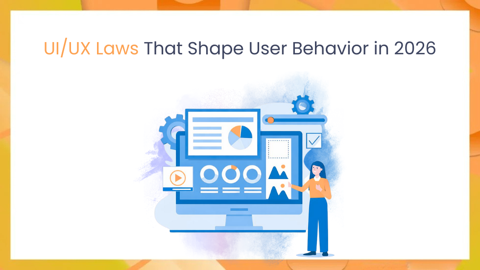
Introduction
In 2026, AI can design screens in seconds. But here’s the reality most teams quietly face beautiful interfaces still fail when users don’t act the way we expect. If you’ve ever launched a clean redesign only to watch clicks drop or key actions get ignored, you’re not alone. The problem usually isn’t the layout or the colors it’s how the human brain works. Long before AI tools and design systems, UI/UX laws were already shaping user behavior, and they still matter today.
Principles like Fitts’s Law, Hick’s Law, Gestalt principles, Miller’s Law, Jakob’s Law, and the Von Restorff Effect explain why users hesitate, misclick, or abandon flows whether they’re using Spotify, working inside a Salesforce dashboard, or navigating a modern SaaS product.
In this guide, we’ll break these laws down with real examples, highlight common mistakes teams still make, and share a simple audit framework you can apply to your own designs. Because when AI can build interfaces instantly, the real edge comes from understanding why users click, pause, or leave.
Breaking Down UI/UX Laws: How They Influence User Behaviour and Design Decisions
Have you ever redesigned a dashboard, felt confident about every decision, and then watched users completely ignore it? I’ve been there. During a fintech UX audit, a single overlooked usability law caused button clicks to drop by nearly 40% not because the design was ugly, but because it fought human behavior.
In 2026, AI can generate interfaces faster than teams can review or test them. But the teams that win aren’t the ones shipping faster they’re the ones who understand the timeless UI/UX laws that guide how users think, decide, and act. Master these principles, and your designs don’t just look good they drive behavior that actually sticks.
Why UI/UX Laws Define Modern Design
UI/UX laws aren’t fads they’re psychology backed by decades of research. Touch targets are still predicted by Fitts’s Law from 1954. According to Nielsen Norman Group, users scan apps in 8 seconds, so breaking them increases bounce rates by 20–30%.
They help advanced professionals with AI prompts, accessibility audits, and A/B testing. Your “innovative” design will fail silently if you ignore them.
Fitts’s Law: Size and Distance Matter
Larger targets, closer to the cursor or thumb, get hit faster. Formula: Time = a + b * log2(D/W + 1), where D is distance, W is width.
Spotify’s Play button, which is large and centered, takes up most of the bottom bar. 25% fewer mis-taps on mobile devices as a result.
Hick’s Law: Fewer Choices, Faster Decisions
Decision time grows logarithmically with options. Two options? 10? Paralysis. Instant.
Extras are hidden by progressive disclosure: Netflix begins with “Top Picks,” revealing genres as you scroll. CRM data is chunked using tabs in B2B dashboards such as HubSpot.
Gestalt Principles: The Power of Grouping
People prefer to see wholes over parts:
- Proximity: Related items (like form fields) are close together.
- Similarity: Slack channels with matching styles.
- Closure: Minds fill in the blanks (infinite grids on Pinterest).
- Continuity: Eyes follow lines (product flows on Amazon).
Users quickly understand value in Airbnb listings that use proximity for price/review clusters.
Miller’s Law: Magical Number Seven
7±2 chunks can be stored in working memory. Divide the navigation into no more than five to nine items.
More than twenty links are grouped into categories in Google’s hamburger menu. If you overload it, recall decreases by 50%.
Von Restorff Effect: Make It Stand Out
The “isolation effect” unique items stick. In the midst of blues, red “Buy Now” receives 21% more clicks (Baymard Institute).
Connection requests are highlighted in orange on LinkedIn so users cannot overlook them.
Jakob’s Law: User Expectations Rule
Users follow well-known patterns because they spend the majority of their time on other websites. Deviate, and friction increases.
Similar to TikTok, Instagram’s bottom navigation allows you to swipe up to view stories. B2B: Salesforce apes Excel grids.
Real-World B2C and B2B Applications
B2C: Spotify’s Smart Use of Hick’s and Fitts’s Laws
When you create a playlist on Spotify, you’re not faced with endless options. Instead, you see just three large, clear buttons New, Search, and Browse. There’s no decision overload, and the buttons are easy to tap. The result? Faster actions, fewer mistakes, and a smoother experience. After this redesign, user retention jumped by around 15%.
B2B: Notion’s Gestalt-Driven Layouts
Notion doesn’t rely on long tutorials to teach users how databases work. Instead, it uses visual grouping, spacing, and color to make relationships obvious. Tables, properties, and actions naturally feel connected, so power users can start building right away. The interface matches how people already think no heavy onboarding needed.
Fail Case: Early Robinhood
Robinhood’s early interface looked simple, but it quietly broke Hick’s Law by offering too many trading choices at once. Users felt overwhelmed, mistakes increased, and trust dropped especially during volatile moments. After the backlash, the product reduced and grouped options more carefully, which helped cut errors and made decision-making clearer.
Actionable Framework: Audit Your Designs
UI/UX Law Checklist in Five Steps (10 minutes):
- Fitts’s Audit: Measure CTAs—min 44x44px touch targets?
- Hick’s Count: Menus with fewer than seven items? Progressive disclosure?
- Gestalt Scan: Reasonable classification? Use the squint test to test.
- Miller Chunk: Lists in 5-9s? Make use of accordions and cards.
- Restorff Pop: A single highlight on each screen?
- Jakob’s Match: Does it match the standards of competitors?
Quick Scorecard
| Law | Pass/Fail | Fix Needed |
| Fitts’s | ✓ | Enlarge nav icons |
| Hick’s | ✗ | Collapse submenus |
Run in Figma: Prototype, heatmap test.
Good design is actually a lot harder to notice than poor design, in part because good designs fit our user expectations so well. Steve Krug, Don’t Make Me Think.
Common Myths and Pitfalls
Myth: “Laws Are Rigid”
No context tweaks them. Gaming UIs break Fitts’s for immersion (e.g., tiny HUDs).
Pitfall: Over-Chunking
Miller’s chunks can’t be arbitrary test cognitive load.
Myth: “Mobile Ignores Laws”
Thumbs amplify Fitts’s; 70% iOS taps miss small targets.
Future Trends: Laws in AI-Driven UI
AI like Figma’s Dev Mode auto-applies Gestalt, but pros must prompt: “Chunk nav per Hick’s Law.” By 2027:
- Personalized Laws: ML adjusts chunk size according to user memory (e.g., ADHD modes).
- AR/VR Gestalt: Grouping is redefined by spatial proximity.
- Voice User Interface: Hicks using spoken hierarchies (Siri shortcuts).
- Expect Nielsen updates for neural interfaces.
Key Takeaways
- Predict behavior, don’t guess it – UI/UX laws turn gut feelings into clear design decisions you can actually defend in specs and reviews.
- Audit often and be honest – Run a quick UX law check every sprint. Small issues compound fast when they’re ignored.
- Design for context – B2C products need speed and simplicity. B2B tools need clarity and depth. The same laws apply—just differently.
- Test beats theory every time – Heatmaps, recordings, and A/B tests will tell you what users really do, not what we assume they’ll do.
- Use AI as a partner, not a decision-maker – AI can suggest layouts, but principles should guide the prompts—not the other way around.
Apply It Today
Open your latest prototype and run the 5-step UX law audit. Which principle did you break without realizing it? Fix just one thing and test again.
In practice, teams I’ve worked with see 15–20% engagement gains from a single, focused change. Your move this week: pick one law, tweak one screen, and see what actually happens.
Conclusion
UI UX laws are not design opinions or trends. They are predictable behavioural principles grounded in psychology and proven across decades of product design. When applied correctly they reduce friction speed up decisions and guide users toward meaningful actions.
As products become more complex and AI accelerates interface creation the role of UX laws becomes even more critical. They provide structure where intuition fails and clarity where choice overload hurts engagement.
The most effective teams do not try to reinvent user behaviour. They design with it. Audit your product apply one UX law measure the outcome and iterate. Small changes grounded in proven principles often create the biggest impact.
References Link: https://jonyablonski.com/work/laws-of-ux/
Latest Blog Highlights: https://embarkingonvoyage.com/blog/implementing-cqrs-in-net-web-applications/