

Author: kishor pawar

  • Top Responsive Design Best Practices for Creating Seamless Digital Experiences

    Top Responsive Design Best Practices for Creating Seamless Digital Experiences

    In today’s hyper-connected world, users engage with digital products across an increasingly diverse range of devices—smartphones, tablets, foldables, wearables, smart TVs, and emerging IoT technologies. As a result, responsive design best practices have evolved far beyond fluid layouts and basic screen adaptability. 

    In 2025, delivering responsive digital experiences means designing for context, accessibility, performance, and adaptability. For enterprise companies and tech-forward startups, mastering responsive UI/UX design is not optional—it’s a strategic imperative that shapes engagement, accessibility, and long-term product scalability. 

    In this blog, we explore the core principles, modern techniques, tools, and real-world examples that define responsive design best practices in 2025—helping product teams build inclusive, adaptive, and high-performing digital experiences. 

    What Is Responsive Design—and Why It Matters More Than Ever in 2025 

    Defining Responsive Design 

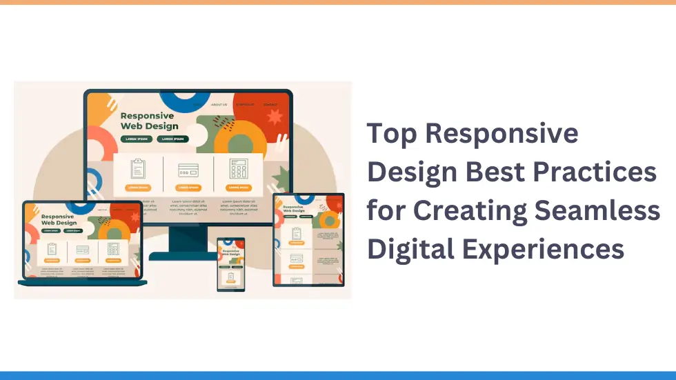
    Responsive design refers to creating digital interfaces that seamlessly adapt to various screen sizes, resolutions, and device capabilities. From smartphones to ultra-wide monitors, responsive web design ensures that usability, readability, and visual hierarchy are preserved across all devices. 

    How Responsive Design Has Evolved 

    Since Ethan Marcotte coined the term in 2010, responsive web design has expanded from three basic pillars—flexible grids, flexible images, and media queries—into a comprehensive, multi-layered practice. Key drivers of this evolution include: 

    • Rapid growth of device types and screen dimensions 
    • Rise of foldables and dual-screen experiences 
    • Emphasis on touch gestures and context-aware interfaces 
    • Tight integration with component-driven development 
    • Greater focus on accessibility and personalized experiences 

    By 2025, modern responsive design demands more than aesthetic fluidity—it requires behavioral adaptability and contextual intelligence. 

    Core Responsive Design Best Practices for UI/UX Designers 

    To build truly responsive digital experiences, designers must adopt these foundational principles: 

    1. Fluid Grids and Flexible Layouts 

    Use relative units (%, em, rem) instead of fixed pixels. This enables components to scale smoothly as the viewport changes, ensuring a consistent experience across devices. 

    2. Flexible Images and Media 

    Apply responsive CSS techniques like max-width: 100% and height: auto to images and videos. Adopt efficient image formats like WebP and AVIF for optimized loading and performance. 

    3. Content-Driven Breakpoints 

    Move beyond device-based breakpoints. Instead, use content-driven media queries that trigger layout changes when necessary to maintain clarity and usability. 

    css 

    CopyEdit 

    @media (min-width: 600px) { … } 
    @media (min-width: 900px) { … } 
     

    4. Mobile-First Design 

    Prioritize mobile constraints by designing from the smallest screen up. This ensures lean performance and scalable feature enhancement for larger devices. 

    Advanced Techniques Shaping Responsive UI/UX in 2025 

    Container Queries 

    With CSS container queries, components respond to the size of their parent container, not just the viewport. This promotes modular responsiveness—ideal for component-based frameworks like React and Vue. 

    css 

    CopyEdit 

    @container (min-width: 400px) { 
    .card { font-size: 1.2rem; } 


    Variable Fonts 

    Implementing variable fonts allows typography to adapt dynamically across screen sizes without loading multiple files—enhancing performance and visual consistency. 

    Adaptive Resource Loading 

    Use responsive techniques like lazy loading, dynamic imports, and <picture> with srcset to serve optimized assets based on bandwidth, device, or battery level. 

    Progressive Enhancement 

    Design core experiences for all users first, then progressively enhance functionality for devices that support advanced features. 

    Accessibility as a Built-In Practice 

    Accessibility is integral to responsive design. Ensure text scaling, proper contrast ratios, keyboard navigation, and screen reader compatibility across breakpoints. 

    Impact of Responsive Design on User Experience 

    Usability and Readability 

    Responsive design ensures that content is always easy to read and interact with—regardless of screen size—by adjusting touch targets, font sizes, and layouts. 

    Performance 

    Fast, seamless interaction is non-negotiable. Apply performance budgets and monitor loading times to maintain responsive speed. 

    User Engagement and Retention 

    Consistent, intuitive responsive UI/UX keeps users engaged across devices, increasing retention and satisfaction. 

    Accessibility and Inclusion 

    A truly responsive experience is accessible to all users, including those using assistive technologies or alternative input methods. 

    Must-Have Tools and Frameworks for Responsive Design 

    CSS Frameworks 

    • Tailwind CSS – Utility-first, highly customizable responsive design 
    • Bootstrap 5 – Reliable grid system with responsive components 
    • Foundation – Accessibility-focused responsive framework 
    • Styled Components / Emotion (CSS-in-JS) – Scoped, logic-aware styling 

    Design and Prototyping 

    • Figma, Adobe XD, Sketch – Responsive prototyping and constraints 
    • Storybook – Component-driven development and visual testing 

    Testing and Performance 

    • Lighthouse – Performance and accessibility audits 
    • BrowserStack, Sauce Labs – Cross-device and responsive testing 

    Embedding Responsiveness in Design Systems 

    Modern design systems must support responsive UI components from the ground up. This includes: 

    • Responsive tokens for spacing, fonts, and breakpoints 
    • Reusable components that adapt via container queries 
    • Documented usage patterns and responsive behaviors 
    • Visual regression testing across viewports 

    A well-structured design system ensures consistency, scalability, and rapid delivery across all platforms. 

    Designer–Product Manager Collaboration 

    Responsive web design success depends on cross-functional collaboration. Teams should align on: 

    • Supported devices based on analytics and research 
    • Accessibility and performance priorities 
    • Sprint planning for testing and iteration 
    • Shared metrics around user satisfaction and responsiveness 

    Practical Tips and Common Pitfalls 

    Tips for Success 

    • Think mobile-first and build upward 
    • Use relative units for scalable elements 
    • Employ content-first breakpoints 
    • Optimize media and use modern image formats 
    • Prioritize accessibility and keyboard navigation 
    • Test on real devices, not just emulators 
    • Monitor performance continuously 

    Pitfalls to Avoid 

    • Designing only for popular screen sizes 
    • Overloading interfaces with animations and media 
    • Ignoring accessibility during layout changes 
    • Failing to consider multiple input methods 
    • Treating responsive design as only a visual task 

    Real-World Examples of Responsive Design Done Right 

    Spotify 

    Spotify adapts across phones, desktops, and TVs using responsive tokens and modular components powered by container queries. Their focus on performance and consistent interaction models ensures a global, frictionless experience. 

    Shopify 

    Shopify’s admin dashboard adjusts dynamically to screen size, with a strong emphasis on accessibility and information hierarchy. It enables merchants to manage stores with ease on any device. 

    Google Maps 

    Google Maps balances responsive UI/UX with complex functionality. It adjusts interface elements and touch targets for mobile, while optimizing controls and map detail for larger screens. 

    Conclusion 

    In 2025, responsive design best practices encompass more than screen adaptation. They integrate accessibility, behavior, context, and performance into every interaction. For enterprise firms, startups, and growing digital products, responsive design isn’t a feature—it’s a strategic foundation. 

    By embracing modern responsive design techniques, leveraging powerful tools, and fostering collaboration, UI/UX teams can build adaptive, future-proof digital experiences that engage users anywhere, on any device. 

    Additional Resources: 

  • How Microinteractions in UI/UX Design Elevate User Engagement and Experience Overnight?

    How Microinteractions in UI/UX Design Elevate User Engagement and Experience Overnight?

    In today’s hyper-competitive digital environment, creating intuitive, responsive, and emotionally resonant user experiences is no longer optional—it’s essential. Whether you’re building a product for enterprises or startups, the fine details often make the biggest impact.

    Among those details, microinteractions in UI/UX design stand out as powerful tools for enhancing usability, building user trust, and increasing engagement. 

    Though often overlooked, these tiny design elements can significantly influence how users perceive and interact with your product—sometimes turning a good experience into a great one, almost overnight. 

    What Are Microinteractions in UI/UX Design? 

    Microinteractions are small, functional animations or feedback mechanisms that guide users, confirm actions, or communicate status updates within an interface.

    These interactive design elements serve a specific purpose—like signaling a button click, confirming a form submission, or showing progress. 

    Common Examples of Microinteractions: 

    • Button animations that ripple or change color upon clicking 
    • Loading spinners or progress bars 
    • Hover effects to indicate clickable items 
    • Form field validations that instantly flag errors 
    • Pull-to-refresh gestures in mobile apps 
    • Toggle switches that animate between states 
    • Notification alerts confirming success or flagging issues 

    While each of these may seem small, collectively they contribute significantly to user satisfaction and interface usability. 

    Why Microinteractions Matter in UI/UX Design 

    Enhancing Usability 

    Microinteractions serve as real-time feedback mechanisms. They: 

    • Confirm user actions (e.g., “Message Sent”) 
    • Communicate system status (e.g., “Uploading…”) 
    • Highlight errors immediately (e.g., “Invalid email”) 

    These cues help users understand that the system is working, reduce uncertainty, and guide them intuitively. 

    Driving User Engagement 

    Microinteractions humanize digital interfaces, making them feel dynamic and responsive. For example: 

    • A satisfying animation on a “like” button creates emotional connection. 
    • Visual cues during onboarding keep users engaged step by step. 

    Incorporating microinteractions in UI animations and transitions enhances user engagement, making users more likely to return and complete actions. 

    Reducing Errors and Friction 

    By providing immediate and contextual feedback, microinteractions reduce form errors, guide corrective actions, and improve overall task completion rates. 

    The Psychology Behind Effective Microinteractions 

    Understanding user psychology is key to designing microinteractions that feel seamless and rewarding. 

    1. Emotional Delight 

    Small surprises—like a bounce animation or a playful sound—can make users smile. These emotional responses strengthen brand affinity and encourage repeat engagement. 

    2. Habit Formation 

    Microinteractions provide positive reinforcement. When users see a checkmark after completing a task, they’re more likely to do it again. This subtle encouragement supports habit-building. 

    3. Cognitive Load Reduction 

    Microinteractions reduce decision fatigue and uncertainty by: 

    • Answering unspoken user questions (“Did that click register?”) 
    • Making interfaces feel intuitive and predictable 
    • Preventing errors before they happen 

    Best Practices for Designing Microinteractions 

    To implement UX best practices in your design system, follow these actionable tips: 

    1. Be Purposeful 

    Each microinteraction must serve a clear function. Avoid decorative animations that don’t support user tasks. 

    2. Ensure Speed and Fluidity 

    Animations should be fast (100–300ms) and not delay user actions. 

    3. Maintain Consistency 

    Use familiar interaction patterns. Uniform behavior across the platform builds user trust. 

    4. Design for Accessibility 

    Support users with different abilities by offering visual, auditory, or haptic cues. Ensure that keyboard navigation and screen readers can interpret all states. 

    5. Use Sparingly 

    Too many microinteractions can distract and frustrate. Focus on areas where they genuinely improve UX. 

    6. Test for Performance 

    Especially on mobile devices, microinteractions should not degrade app performance or drain battery life. 

    Integrating Microinteractions into Product Strategy 

    1. Embed in Design Systems 

    Create a scalable design language by defining consistent interaction patterns and animation rules. This approach streamlines development while ensuring brand consistency. 

    2. Collaborate with Product Managers 

    Align microinteractions with business goals such as: 

    • Reducing user churn 
    • Increasing conversions 
    • Enhancing onboarding 

    Including microinteractions in product roadmaps ensures they are not treated as afterthoughts but as strategic design elements. 

    Real-World Applications of Microinteractions in UI/UX Design 

    Slack – Reinforcing Trust 

    Slack introduced message delivery animations and error indicators during poor network conditions. These subtle feedback cues reduced user uncertainty and improved the communication experience. 

    Airbnb – Streamlining User Flow 

    Airbnb uses animated calendar dates, instant validation on forms, and dynamic search spinners to guide users seamlessly through the booking journey—reducing friction and building trust. 

    Instagram – Adding Delight 

    Instagram’s “like” animation turns a simple tap into a moment of joy. The animated burst reinforces interaction, making the experience feel rewarding and social. 

    Conclusion 

    Microinteractions are not just “nice-to-have” features—they’re essential to creating delightful, intuitive, and functional digital products. Whether it’s a startup aiming for rapid user adoption or an enterprise optimizing UX at scale, integrating microinteractions in UI/UX design can lead to measurable improvements in user satisfaction, engagement, and retention. 

    If your product feels static, disconnected, or confusing, the quickest way to elevate it is by refining the small moments. Because in UX, small things aren’t small—they’re everything. 

    Looking to Improve Your Product’s UX? 

    At EmbarkingOnVoyage Digital Solutions, we help startups, ISVs, and enterprises design and develop scalable digital experiences. From intuitive UI/UX design to full-scale product development, our team builds with precision, performance, and people in mind. 

    Additional Resources: 

  • Tailwind CSS vs Bootstrap: Which Framework is Right for Your UI in 2025? 

    Tailwind CSS vs Bootstrap: Which Framework is Right for Your UI in 2025? 

    In 2025, selecting the right front-end framework isn’t just a technical decision—it’s a strategic one. For enterprise companies, startups, and product teams aiming to deliver user-centered digital experiences, Tailwind CSS vs Bootstrap remains a critical comparison. 

    Both are leading CSS frameworks that help teams accelerate development, maintain design consistency, and align with modern UI/UX practices. But which one fits your unique product needs better in today’s competitive landscape? 

    Let’s explore how Tailwind CSS and Bootstrap perform across six key areas: design thinking, responsive design, UX principles, user research, design systems, and cross-functional collaboration. 

    1. Design Thinking: Flexibility vs Structure 

    At the heart of effective product design is design thinking—an iterative process emphasizing empathy, ideation, prototyping, and testing. 

    • Tailwind CSS empowers teams with utility-first styling. This means designers can quickly build and iterate UI elements with complete control over aesthetics. It’s ideal for rapid prototyping and testing new ideas without being boxed in by predefined components. 
    • Bootstrap provides a solid set of ready-made UI components and styles. This structured approach is beneficial for teams aiming to validate concepts quickly, especially in early development stages. 

    Verdict: Choose Tailwind for creative flexibility; opt for Bootstrap for quicker proof-of-concept execution. 

    2. Responsive Design: Mobile-First Is Just the Beginning 

    Responsive design is no longer a bonus—it’s an expectation. Bootstrap vs Tailwind CSS both address this, but in distinct ways: 

    • Bootstrap has long been favored for its mobile-first grid system, breakpoints, and responsive utility classes, making it easy to build cross-device layouts. 
    • Tailwind CSS offers even greater flexibility, allowing developers to customize breakpoints based on specific audience behavior. This makes it a preferred tool when aligning with user analytics and advanced UI/UX design strategies. 

    Example: A SaaS company tailored their onboarding flow using Tailwind’s custom breakpoints and increased mobile retention by 15%. 

    Verdict: Bootstrap suits general responsiveness needs, while Tailwind excels in tailored, data-driven responsive design. 

    3. Applying UI/UX Laws with Precision 

    Understanding human behavior through UX laws is key to crafting intuitive interfaces. When comparing Tailwind CSS vs Bootstrap for this purpose: 

    • Hick’s Law: Tailwind’s granular utility classes help reduce cognitive load by precisely controlling content visibility and hierarchy. 
    • Fitts’s Law: Bootstrap provides accessible touch targets with pre-set sizes—great for newer designers. Tailwind, however, allows pixel-level control for refined touch zones based on actual user interaction. 
    • Law of Proximity: Tailwind simplifies grouping through its customizable spacing utilities. Bootstrap follows a structured layout that supports basic proximity-based design. 

    Verdict: Tailwind enables precision in UX law implementation; Bootstrap offers strong defaults for faster execution. 

    4. From User Research to UI Execution 

    A strong UI is grounded in real user feedback—from usability tests to A/B experiments. 

    • Bootstrap shines when teams want to test UI variations quickly. Its components are ideal for early-stage assumptions and concept testing. 
    • Tailwind CSS comes into play post-research, allowing teams to fine-tune UI based on specific findings and behavior insights. 

    Example: An e-commerce brand A/B tested checkout flows using Bootstrap, then transitioned to Tailwind to build a more branded and conversion-optimized experience—resulting in a 22% lift in sales. 

    Verdict: Bootstrap helps validate concepts; Tailwind helps refine them into polished, user-centric designs. 

    5. Design Systems and Scalability 

    In today’s product development, scalability equals success. Design systems ensure consistency, collaboration, and long-term maintainability. 

    • Tailwind CSS works seamlessly with atomic design systems, design tokens, and tools like Figma and Storybook. It allows for consistent styling across platforms and supports growing product needs. 
    • Bootstrap offers a dependable component library, but customization can become challenging as your product scales or brand needs evolve. 

    Verdict: Bootstrap is ideal for consistent small-to-medium projects; Tailwind is better suited for scalable, enterprise-grade design systems. 

    6. Collaboration with Product Management 

    Modern product development is a team sport. Designers, developers, and product managers must align on features, goals, and workflows. 

    • Bootstrap supports fast MVP development and provides visual clarity through its standard components, enabling quick discussions around features and layout. 
    • Tailwind CSS brings greater transparency to development. Its utility classes align closely with design and user stories, helping product managers track progress and iterate with precision. 

    Case Study: A startup building an analytics dashboard used Tailwind CSS to map UI components directly to customer journey stages, speeding up delivery and improving stakeholder alignment. 

    Verdict: Bootstrap supports speed and clarity in MVPs; Tailwind fosters detailed collaboration and long-term product alignment. 

    🧩 Tailwind CSS vs Bootstrap: Quick Comparison Table 

    Use Case Best Choice 
    Rapid Prototyping Bootstrap 
    Custom Branding & UX Laws Tailwind CSS 
    Scalable Design Systems Tailwind CSS 
    Entry-Level Projects Bootstrap 
    Agile, Cross-Functional Teams Tailwind CSS 
    MVP or Proof of Concept Launch Bootstrap 

    Final Thoughts: Tailwind CSS vs Bootstrap—The Right Choice for You 

    When it comes to choosing between Tailwind CSS vs Bootstrap in 2025, there’s no one-size-fits-all answer.

    Your choice should depend on your team’s priorities: 

    • Choose Bootstrap for fast setup, structured components, and early-stage product testing. 
    • Choose Tailwind CSS for brand-focused designs, scalable systems, and refined control over the user experience. 

    Whichever path you choose, remember: success lies not just in the tool, but in how you apply design thinking, UX principles, and user data to drive meaningful digital outcomes. 

    📢 About EmbarkingOnVoyage Digital Solutions 

    At EmbarkingOnVoyage, we specialize in building modern, scalable, and user-centric applications using frameworks like Tailwind CSS, Bootstrap, and beyond. Whether you’re a startup, seed-funded company, or enterprise brand, we help transform ideas into reality through thoughtful software development, product engineering, and agile collaboration. 

    Additional Resources: 

  • Why Accessibility in UI/UX Should Be Your Product’s Top Priority in 2025?

    Why Accessibility in UI/UX Should Be Your Product’s Top Priority in 2025?

    In today’s fast-paced digital economy, great UI/UX design isn’t just about sleek visuals or modern interfaces—it’s about creating experiences that work for everyone. Still, accessibility in UI/UX remains underutilized by many product teams, often treated as an afterthought or a compliance checkbox. 

    The truth? Accessible design is a competitive advantage that drives innovation, improves usability, and expands your audience. For enterprises and startups alike, embedding accessibility into your design system from day one leads to scalable, inclusive, and legally compliant products. 

    Let’s explore how digital accessibility best practices elevate user experience—and why your next product iteration should prioritize inclusive design. 

    What Accessibility in UI/UX Really Means 

    Accessibility in UI/UX refers to designing digital experiences that can be perceived, understood, and interacted with by users of all abilities.

    This includes individuals with: 

    • Visual impairments (e.g., low vision, color blindness, or blindness) 
    • Auditory impairments 
    • Motor disabilities 
    • Cognitive challenges (e.g., ADHD, dyslexia) 
    • Temporary or situational constraints (e.g., one-handed use, screen glare, or background noise) 

    By addressing these variations, inclusive UX ensures that no user is excluded—regardless of ability, device, or context. 

    Why Accessible Design Enhances Usability for All 

    Accessible design isn’t just beneficial for users with disabilities—it improves the user experience for everyone: 

    • Keyboard navigation assists both users with mobility challenges and power users. 
    • High-contrast interfaces support readability in bright environments. 
    • Descriptive link text improves clarity for screen readers and boosts SEO. 
    • Semantic HTML and a logical page structure enhance comprehension and accessibility. 

    Much like curb cuts on sidewalks benefit strollers, luggage, and bicycles—not just wheelchairs—accessible UI brings daily convenience to a broader audience. 

    Applying Accessibility to Core UI/UX Principles 

    1. Empathy in Design Thinking 

    Great UX begins with empathy. By including users with disabilities in research and persona development, product teams uncover insights that benefit a wider range of users. Accessibility should be considered from ideation—not retrofitted in QA. 

    2. Responsive Design for All Contexts 

    Responsive design isn’t just about screen sizes—it’s about adaptable interaction. Consider users navigating via voice commands, screen readers, or eye-tracking tools. A truly inclusive interface responds to how users interact, not just where

    3. UI/UX Laws That Promote Accessibility 

    • Fitts’s Law: Larger, easier-to-tap buttons help users with motor challenges. 
    • Hick’s Law: Simplified choices reduce cognitive load for all users. 
    • Law of Proximity: Grouping related elements aids comprehension—especially for screen readers. 

    These design laws aren’t just guidelines—they’re accessibility enablers. 

    The Business Case for Accessibility in UI/UX 

    ✅ Expanded Market Reach 

    Globally, over 1 billion people live with some form of disability. Ignoring accessibility excludes a massive user base. Inclusive design ensures your product is usable by more people—without limiting creativity. 

    ✅ Higher User Engagement 

    Example: After redesigning its website to meet WCAG 2.1 standards, a leading airline saw a 26% increase in booking conversions. Accessible products perform better—across all demographics. 

    ✅ Reduced Legal Risk 

    Laws like the ADA and European Accessibility Act mandate digital accessibility. Failing to comply can lead to lawsuits, fines, and reputational damage. Designing inclusively from the start reduces legal risk and future technical debt. 

    ✅ Brand Loyalty and Trust 

    When users feel seen and supported, they engage more deeply. Accessible brands are perceived as thoughtful and responsible—fostering long-term loyalty. 

    Embedding Accessibility in Your Design System 

    A scalable design system should include accessibility guidelines. Here’s how: 

    • Color tokens: Use palettes with at least a 4.5:1 contrast ratio. 
    • Typography rules: Define font sizes with relative units (like rem) and ensure a clear hierarchy. 
    • ARIA roles and landmarks: Improve screen reader interactions within documented components. 
    • Accessible UI components: Build reusable elements—buttons, forms, modals—that support keyboard navigation and screen readers. 

    Tools like Stark and Able (for Figma), or Storybook a11y, make accessibility testing an integrated part of your workflow. 

    Designers and Product Managers: A Shared Responsibility 

    Accessibility isn’t the designer’s job alone. It’s a cross-functional effort. 

    • Set accessibility as a requirement from sprint 0
    • Include accessibility success criteria in design specs and user stories. 
    • Recruit participants with diverse abilities for usability testing. 
    • Track accessibility metrics—like task success rates using keyboard-only input. 
    • Budget for testing with assistive tools (screen readers, switch controls, etc.). 

    When accessibility is integrated early, it becomes a natural part of product development—not a retrofit. 

    Quick-Start Accessibility Checklist 

    Start improving your product’s accessibility today: 

    • Use semantic HTML (<button>, <nav>, <label>, etc.) 
    • Ensure full functionality via keyboard-only navigation 
    • Maintain minimum 4.5:1 contrast ratio for text 
    • Avoid using color alone to convey meaning 
    • Provide visible focus indicators 
    • Write descriptive link text (e.g., “Download Report” vs. “Click here”) 
    • Label all form inputs clearly 
    • Test with screen readers (e.g., NVDA, VoiceOver, TalkBack) 
    • Offer skip navigation links 
    • Avoid auto-playing media without controls 

    Final Thoughts: Make Accessibility Your Competitive Edge 

    In 2025 and beyond, accessibility in UI/UX isn’t just a requirement—it’s a differentiator. It empowers users, reduces risk, and creates products that scale responsibly and inclusively. 

    Designing with accessibility in mind doesn’t limit innovation—it amplifies it. 

    The question isn’t whether you can afford to design accessibly—it’s whether you can afford not to. 

    Need help designing accessible digital products? 

    At EmbarkingOnVoyage Digital Solutions, we help enterprises and startups build inclusive, scalable, and high-performance applications. Our expert design and engineering teams specialize in crafting user interfaces that deliver value for everyone—across industries and user types. 

    Additional Resources: 

  • How a UX Overhaul Can Transform Your Enterprise Software Experience?

    How a UX Overhaul Can Transform Your Enterprise Software Experience?

    In today’s digital-first business environment, an outdated enterprise app can do more harm than good.

    Whether it’s an internal HR tool or a client-facing analytics dashboard, poor user experience leads to low adoption, workflow inefficiencies, and even revenue loss. Gone are the days when functionality alone could carry an app—now, UX is the differentiator

    If your application feels clunky, unintuitive, or outdated, a UX overhaul isn’t just optional—it’s critical.

    This blog explains why a modern user experience is essential for enterprise apps, how enterprise UX design has evolved, and the steps to implement a successful UI/UX transformation

    Why UX Matters More Than Ever in Enterprise Apps 

    Historically, enterprise applications were built by engineers with one goal: functionality. The result? Feature-rich tools that were difficult to use, visually outdated, and slow to adopt. Users were expected to adapt to the software, not the other way around. 

    But expectations have changed. Thanks to consumer-grade experiences like Slack, Notion, and Google Workspace, users now demand intuitive, aesthetically pleasing, and efficient enterprise tools. Poor enterprise app usability is no longer acceptable. 

    Today, user-centered design is a business imperative—not a luxury. Tech giants like Salesforce and Microsoft have invested heavily in UX overhauls, integrating design systems, conducting user research, and building accessibility into every layer of their platforms. 

    Modern Best Practices in Enterprise UX Design 

    To keep up, your enterprise app needs to align with current UX standards. Here are key best practices: 

    1. User-Centered Design (UCD) 

    • Base all decisions on actual user needs, goals, and behaviors. 
    • Conduct persona development and usability testing early and often. 

    2. Design System Implementation 

    • Standardized components streamline development and ensure a consistent experience. 
    • Promotes scalability and cross-team alignment. 

    3. Task-Based Navigation 

    • Focus navigation around real tasks to reduce cognitive load. 
    • Avoid feature bloat and information overload. 

    4. Responsive and Performance-Driven UI 

    • Fast load times, even on data-heavy dashboards, are essential. 
    • Interfaces should perform smoothly across devices and screen sizes. 

    5. Accessibility and Inclusivity 

    • Follow WCAG guidelines to accommodate users with disabilities. 
    • Consider diverse use cases including localization, color blindness, and assistive technologies. 

    Why Accessibility and Inclusivity Drive ROI 

    Accessible design is good design. Enterprise teams span generations, regions, and physical abilities. Building inclusive applications increases productivity, broadens adoption, and decreases user errors. 

    Leveraging tools like Microsoft’s Inclusive Design Toolkit can help teams address real-world needs, from screen reader compatibility to culture-aware color palettes. Inclusivity also improves usability for all users—not just those with accessibility needs. 

    The Role of AI and Automation in UX Overhaul 

    AI-powered UX is revolutionizing enterprise applications. When integrated thoughtfully, automation and intelligence reduce manual effort, speed up workflows, and enhance usability. 

    Examples include: 

    • Predictive Search: Smart suggestions based on recent activity. 
    • AI Chatbots: Real-time support and self-service tools. 
    • Workflow Automation: Triggered actions through tools like Zapier or Power Automate. 

    However, ethical concerns like data privacy and transparency must be considered. UX designers should work closely with data teams to craft intelligent, user-friendly solutions that add value—without being intrusive. 

    Why Mobile-First UX is Crucial 

    Remote work, field operations, and BYOD policies have made mobile-first enterprise UX a necessity. Apps must offer: 

    • Touch-friendly interfaces 
    • Optimized layouts for tablets and smartphones 
    • Seamless cross-device continuity 

    Responsive design isn’t about shrinking a desktop UI—it’s about rethinking user interactions from the ground up. 

    Emerging UX Trends to Watch 

    Enterprise UX is evolving rapidly. Here are a few trends influencing the future: 

    1. Voice User Interfaces (VUIs) 

    • Hands-free interactions for on-the-go or hands-busy professionals. 
    • Integration with voice assistants like Alexa for Business. 

    2. AR/VR Integration 

    • Immersive training programs and interactive data dashboards. 
    • Especially useful in industries like manufacturing and healthcare. 

    3. Microinteractions 

    • Subtle animations that guide users and offer feedback. 
    • Examples: Slack’s fun loading messages or Gmail’s undo send action. 

    4. Context-Aware UX 

    • Interfaces adapt based on user roles, location, or behavior. 
    • For example, showing different tools to HR managers and sales reps. 

    Real-World UX Overhaul Success Stories 

    Here’s how some leading companies transformed their enterprise UX: 

    • Salesforce Lightning: Replaced its outdated UI with a clean, modular interface, significantly improving usability. 
    • Microsoft Teams: Streamlined collaboration by merging chat, calls, and file sharing—all with a mobile-optimized UI. 
    • ServiceNow: Moved from a rigid IT system to a flexible, intuitive platform with high adoption rates. 

    All three invested in UX audits, user research, and design system implementation to drive long-term success. 

    Actionable Steps to Overhaul Your App’s UX 

    Ready to modernize your enterprise application? Here’s a roadmap: 

    1. Conduct a UX Audit: Identify pain points, navigation bottlenecks, and poor-performing user flows. 
    1. Gather Real User Feedback: Run surveys, usability tests, and stakeholder interviews. 
      1. Set Clear Business KPIs: Metrics like reduced support tickets or faster task completion help justify ROI. 
        1. Create Wireframes and Prototypes: Use tools like Figma or Adobe XD for testing early concepts. 
          1. Implement a Scalable Design System: Build UI components that are consistent, reusable, and dev-ready. 
            1. Launch, Measure, and Iterate: Continuous feedback and analytics help refine the experience over time. 

              Future-Proofing Your UX and Design Teams 

              To stay competitive, your UX team needs to: 

              • Stay Informed: Follow leading design blogs, attend conferences, and study case studies. 
              • Master New Tools: From AI-integrated platforms to real-time prototyping tools. 
              • Practice Empathy: Understand users deeply—beyond what analytics show. 
              • Collaborate Cross-Functionally: Work with developers, product owners, and analysts to align vision and execution. 

              Conclusion: UX Overhaul Is a Strategic Business Move 

              A successful UX overhaul can transform your enterprise app from a productivity blocker to a competitive advantage. By investing in modern design principles, inclusive experiences, and continuous improvement, your software becomes not just a tool—but a partner in business growth. 

              Don’t wait until your users abandon your app—invest in a user experience upgrade that drives results. 

              Additional Resources: 

            1. The Future of Web Accessibility: Trends and Innovations 

              The Future of Web Accessibility: Trends and Innovations 

              In today’s digital age, accessibility is no longer an afterthought but a fundamental requirement for any successful software product.  

              Designing for accessibility ensures that your product can be used by everyone, regardless of their abilities.  

              This not only fosters inclusivity but also improves overall user experience and can even help you avoid legal pitfalls. 

              Why Accessibility Matters?

              Why Accessibility Matters?

              • Inclusivity: Approximately 15% of the world’s population has some form of disability. By designing for accessibility, you’re ensuring that your product is usable by a broader audience. 
              • Legal Compliance: Many countries have regulations mandating digital accessibility. For example, the Americans with Disabilities Act (ADA) in the U.S. and the Web Content Accessibility Guidelines (WCAG) set standards that digital platforms must meet. 
              • Enhanced User Experience: Accessibility often leads to a better user experience for all users, improving navigation, readability, and overall engagement. 

              Key Principles of Accessible Design 

              Key Principles of Accessible Design 

              Accessibility is a fundamental aspect of creating inclusive digital experiences.  

              By adhering to the following key principles, you can ensure that your software products are usable by everyone, regardless of their abilities. 

              Perceivable 

              • Text Alternatives: Provide text alternatives for all non-text content, such as images, videos, and audio files. This ensures that users who are unable to see or hear the content can still understand its meaning. 
              • Color Contrast: Use sufficient color contrast between text and background colors to improve readability for users with visual impairments. 
              • Responsive Design: Ensure that your design adapts to various screen sizes and devices, making it easier for users with different needs to interact with your content. 

              Operable 

              • Keyboard Navigation: Allow users to navigate your interface using only a keyboard. This is essential for users who may have difficulty using a mouse or touch screen. 
              • Clear Navigation: Use a consistent and intuitive navigation structure that is easy for users to understand and follow. 
              • Accessible Forms: Ensure that all forms are accessible to users with disabilities. This includes providing clear labels for input fields, using appropriate input types, and avoiding CAPTCHAs. 

              Understandable 

              • Plain Language: Use clear and concise language that is easy to understand for users of all levels. Avoid jargon or technical terms that may confuse users. 
              • Consistent Layout: Maintain a consistent layout throughout your product to help users navigate and understand the content. 
              • Clear Instructions: Provide clear and concise instructions for completing tasks. Use simple language and avoid overly complex explanations. 

              Robust 

              • Screen Reader Compatibility: Ensure that your content can be read by screen readers, which are used by users who are blind or visually impaired. 
              • Semantic HTML: Use proper HTML elements and structure to convey the meaning of your content to assistive technologies. This helps screen readers and other assistive technologies interpret and present your content accurately.  

              Implementing Web Accessibility: A Step-by-Step Guide 

              Implementing Web Accessibility: A Step-by-Step Guide 

              1. Conduct a Baseline Assessment: Assess the current accessibility of your website or application. Use tools like WAVE or Axe to identify potential issues. 
              2. Develop an Accessibility Plan: Create a comprehensive plan that outlines your organization’s commitment to accessibility and sets specific goals and timelines. 
              3. Train Your Team: Educate your team members about accessibility best practices and provide them with the necessary resources and tools. 
              4. Prioritize Accessibility: Integrate accessibility into your development process from the beginning. Consider accessibility as an essential aspect of your product’s quality assurance. 
              5. Test and Iterate: Regularly test your product for accessibility using a variety of assistive technologies. Continuously monitor and improve your accessibility efforts. 

                Tools and Resources for Web Accessibility

                Tools and Resources for Web Accessibility

                • Accessibility Testing Tools: WAVE, Axe, JAWS, NVDA 
                • Color Contrast Analyzers: Contrast Checker, Stark 
                • WCAG Guidelines: W3C Web Content Accessibility Guidelines 
                • Accessibility Communities: W3C Accessibility Working Group, WebAIM 

                Conclusion 

                Conclusion 

                Designing for accessibility is not just a legal requirement but a moral obligation. By prioritizing inclusivity, you create a better user experience for everyone.  

                By integrating accessibility into your design process from the beginning, you can ensure that your software product is accessible, inclusive, and enjoyable for all users. 

                Remember, web accessibility is an ongoing process.  

                By continuously evaluating and improving your product’s accessibility, you can create a more inclusive and user-friendly digital experience. 

                What steps have you taken to improve the accessibility of your website or application? Share your experiences and insights in the comments below

                Additional Resources: