Author: kishor pawar

  • AI-Native UI/UX: 5 Powerful Reasons Workflow-Centric Design Wins

    AI-Native UI/UX: 5 Powerful Reasons Workflow-Centric Design Wins

    Most enterprise software is organized around screens and modules. An user navigates to a specific place to complete a specific task. However, in the era of AI-native UI/UX, this approach creates a technical bottleneck. Intelligent platforms naturally collapse navigation, yet they often inherit legacy interfaces built around screens the user no longer needs to visit.

    This article explores workflow-centric design where the interface is built around the user’s ultimate goal, and Agentic AI handles the backend traversal. The business impact? Shorter task completion times, minimized context switching, and significantly lower training overhead for global B2B teams.

    1. The Context: Eliminating the Navigation Tax

    Screen-centric design assumes the human user is the engine moving work between systems opening the CRM, switching to the ERP, checking a reporting tool, and manually carrying context across each step.

    AI-native platforms eliminate this need. An Agentic AI can query the ERP, cross-reference global CRM data, and draft a final output without the user opening any of those applications. But if the UI is still designed as a set of siloed modules, the platform actively fights its own capabilities:

    • Navigation Overhead: Users still hunt through complex menus for capabilities the AI could have surfaced in context.
    • Context Loss: Moving between screens discards the working state the AI just assembled.
    • Mental Model Mismatch: Users think in tasks (e.g., “launch the outbound sales sequence”); traditional UI thinks in screens.

    Industry analysis is clear: the defining question of modern enterprise software is no longer how humans navigate software, but how work moves seamlessly across the global organization.

    2. Modeling the Workflow, Not the Screen Map

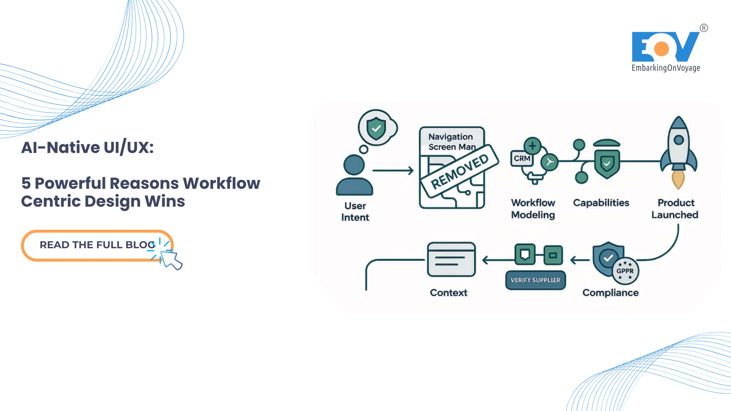
    Effective AI-native UI/UX defines the interface by the user’s goal and the necessary steps to achieve it, rather than relying on a traditional sitemap of modules.

    Consider the process of integrating a new travel technology API or onboarding a global supplier. The end goal is a verified, active integration ready for use. A workflow-centric platform presents this as a single, connected thread. The AI pre-fills technical details from uploaded documentation, runs the compliance check autonomously, and suggests operational parameters based on comparable data. The user moves through one coherent task instead of visiting four separate modules and manually stitching the work together themselves.

    3. Carrying Context Forward Automatically

    The defining property of workflow-centric design in AI-native UI/UX is that state persists across steps. Data captured in step one is available without re-entry in the final step. The AI maintains the working context; the user simply maintains the intent.

    This eliminates the hidden tax of screen-centric software: the constant re-finding, re-typing, and re-orienting required every time a user crosses a module boundary. When context travels with the task, that tax disappears entirely.

    4. Surfacing Capability in Context

    Instead of a massive global navigation menu listing every platform capability, the interface should only offer actions relevant to the current step. If a capability isn’t needed right now, it shouldn’t be on the screen at all. This drastically reduces cognitive load, accelerates completion times, and makes the platform exceptionally easy to learn—there are no complex menus to memorize, only the next logical action.

    Module Navigation vs. Workflow Threads This is a core UI/UX trade-off that requires deliberate decision-making. Module navigation maps neatly onto back-end system organization; it is easier to build but forces the integration burden onto the user. Workflow threads organize the interface around goals and let the AI traverse the systems. They demand more sophisticated UI/UX design effort upfront, but perfectly match how users actually think and work on a daily basis.

    5. Global Security & Compliance Considerations

    Workflow-centric design fundamentally changes how data and permissions flow across a system. Maintaining robust, global compliance requires modern UI approaches:

    • Step-Scoped Permissions: Grant access per workflow step, not per module. A user holds only the rights required for the exact step they are currently executing.
    • Data Lineage Across Steps: Record precisely how context is assembled and transformed as it moves through the UI to ensure full auditability.
    • Embedded Gates: Place compliance checkpoints directly inside the workflow interface itself. This ensures oversight happens exactly where the work occurs, without breaking the user experience.
    • Zero-Trust Context Handling: Validate carried-forward context at each individual step, rather than blindly trusting the state assembled earlier in the process.
    • Embedded Gates: Place compliance checkpoints directly inside the workflow interface itself. This ensures oversight and adherence to frameworks like the EU AI Act happens exactly where the work occurs, without breaking the user experience.
    • Data Minimization: Carry only the specific context a step needs, strictly aligning with GDPR data protection principles.

    The Bottom Line

    • Screen-centric design fights AI-native UI/UX. It forces users to navigate and carry context that the AI has already removed the need for.
    • Organize around goals, not modules. Model the workflow, carry context forward automatically, and surface capabilities only when needed.
    • Embed compliance natively. Step-scoped permissions keep workflow-centric platforms highly auditable and perfectly suited for global enterprise operations.

    Build the Future of Enterprise AI EmbarkingOnVoyage (EOV) drives AI-native UI/UX, designing workflow-centric interfaces for complex, global enterprise platforms. By restructuring software around user goals, we empower B2B teams to complete work in fewer steps, with less navigation, and significantly lower training overhead.

    Explore EOV’s AI-First Digital Experiences

    Lates Blog Highlight : https://embarkingonvoyage.com/blog/ai-native-digital-product-engineering/

  • Building Voice User Interfaces: 3 Essential Steps to Lower Latency

    Building Voice User Interfaces: 3 Essential Steps to Lower Latency

    Introduction

    Graphical user interfaces do not translate directly to screenless environments, often causing severe cognitive overload and high abandonment rates during transient interactions. Legacy text-based workflows fail entirely when forced to handle the asynchronous complexity of human speech. To resolve this, engineering teams must deploy state-based intent architectures paired with explicit conversational design patterns for modern voice user interfaces (VUIs). By replacing open-ended queries with directed parameters and implementing multimodal fallbacks, engineers can construct robust, context-aware frameworks. Implementing these structured workflows directly minimises API latency, lowers cloud compute costs, and ensures strict adherence to regional compliance standards.

    The Context / The Problem

    Why is this a challenge right now? Voice user interfaces are scaling rapidly, with the global voice commerce sector projected to process nearly €80 billion by 2035 [market growth analysis]. Despite this growth, traditional development approaches fail in audio-first environments because visual and voice modalities possess fundamentally different cognitive constraints.

    Visual interfaces allow users to browse safely and visually confirm system status before executing commands. Voice interactions, however, are highly transient and demand significant short-term memory.

    Real-world constraints frequently compound these issues. Legacy manufacturing systems often cannot handle the throughput required for real-time analytics, and basic voice systems similarly fail when pushed beyond simple, isolated commands. Users operating heavy machinery, driving vehicles, or executing manual tasks cannot safely monitor visual screens. Relying on open-ended prompts under these environmental constraints leads directly to system failure, higher cloud latency due to repeated query processing, and severe user frustration.

    The Technical Deep-Dive / Architecture

    Architecting Context and Memory The foundation of a production-ready VUI involves managing conversational state and retaining contextual memory across multiple interactions. If a user requests climate metrics (e.g., measuring room temperature in Celsius), the natural language understanding model must lock that context for subsequent queries.

    We chose PostgreSQL over MongoDB here because strict ACID compliance was non-negotiable for this financial data. Tracking persistent state for secure voice-activated commerce requires a system that guarantees atomicity and durability, ensuring transactions never fail silently. A structured database architecture ensures that all conversational parameters are accurately mapped and retained securely over time.

    Defining Explicit Parameters

    To eliminate open-ended prompts and reduce unnecessary cloud latency, engineering teams must enforce implicit confirmations and strict intent routing. Open queries must be replaced with explicitly defined state payloads.

    Below is a standard JSON payload demonstrating how parameters are strictly defined to constrain user inputs and reduce speech recognition errors:

    {
      "intent": "AdjustThermostat",
      "parameters": {
        "target_temperature": 22,
        "unit": "Celsius"
      },
      "context": {
        "userId": "usr_8492",
        "lifespan": 5
      },
      "error_handling": {
        // Fallback message explicitly defines options so junior engineers can quickly follow the error recovery logic
        "fallback_message": "Did you want to set the temperature to 20 or 22 degrees?" 
      }
    }

    By constraining the user’s available choices through explicit error handling, the system natively handles edge cases without dropping the session or requiring costly cloud-side reprocessing.

    Interaction TypeCloud Latency ImpactUser Cognitive LoadError Recovery
    Open-Ended VUIHigh (Requires heavy NLP processing)High (Requires memorisation)Poor (“I didn’t understand”)
    State-Based VUILow (Pre-defined JSON parameters)Low (Explicit choices offered)High (Contextual prompting)

    Multimodal Audio Redundancy

    Relying solely on audio introduces latency uncertainty. Modern voice systems must integrate multimodal redundancies to ensure clear system status. When a microphone activates, the hardware should immediately output a brief audio tone paired with an LED indicator pulse. This deliberate redundancy ensures the user visually understands the device’s operational state without needing explicit, time-consuming verbal confirmations.

    Voice user interfaces architecture diagram showing the flow from voice input to structured database intent

    Security & Compliance Considerations

    Data Privacy in Voice Processing Continuous audio recording mechanisms introduce severe surveillance and compliance risks. Voice user interfaces deployed within the European Union must be engineered strictly around consent and robust security parameters. Implementing Zero-Trust principles across the entire data transmission pipeline is an absolute requirement.

    To maintain rigorous GDPR compliance, raw audio inputs must be processed on-device via edge computing wherever technically feasible. Furthermore, enforcing Tech Sovereignty through rigid data localisation policies prevents sensitive user telemetry from leaving designated European cloud environments. Teams must explicitly define Data Lineage models to map exactly where user recordings are stored, how they are routed, and when they are definitively anonymised.

    The Bottom Line

    • Deploy state-based intent architectures: Eliminate open-ended conversational prompts and implement constrained, context-aware database mapping to lower cognitive overhead and reduce cloud latency.
    • Implement multimodal redundancy: Synchronise audio confirmations with visual hardware cues to clearly communicate system state and prevent privacy anxieties.
    • Enforce strict European compliance standards: Default to edge computing and rigid data localisation to guarantee GDPR compliance, Zero-Trust security, and absolute Tech Sovereignty for all voice user interfaces.

    Transitioning from graphical legacy applications to secure, conversational architectures requires highly specialised engineering capabilities. EmbarkingOnVoyage builds these solutions for enterprise partners, delivering highly compliant, robust voice platforms that ensure operational efficiency and tangible business outcomes.

    Latest Blog highlight : https://embarkingonvoyage.com/blog/physical-ai-industry-4-0-europe/

  • Mastering the UI/UX Workflow with Figma: From Wireframes to Prototypes

    Mastering the UI/UX Workflow with Figma: From Wireframes to Prototypes

    In the high-speed world of digital product development, particularly in industries like travel, UI/UX workflow efficiency is no longer a luxury—it’s a necessity.

    Enterprise teams, startups, and seed-funded companies must ship user-friendly, consistent, and interactive experiences quickly to stay ahead. 

    That’s where a streamlined UI/UX workflow with Figma makes a real difference. 

    More than just a design tool, Figma has evolved into a collaborative ecosystem for designers, product managers, and developers to work in sync—from early wireframes to polished prototypes and developer-ready handoffs. 

    This blog explores how you can optimize your entire product design cycle using Figma, with a travel app example that reflects real-world complexity and scalability. 

    ✈️ Real-World Use Case: Designing a Travel App with Figma 

    Let’s imagine your product team is building a mobile app called GlobeHop with key features like: 

    • Flight search 
    • Hotel booking 
    • Trip itinerary builder 
    • Real-time travel alerts 

    These features require a fast and collaborative UI/UX design workflow, where multiple teams can build and test features without breaking design consistency or losing momentum. 

    🧱 Step 1: Start with Wireframes – Fast, Clear, Collaborative 

    The foundation of any effective UI/UX workflow begins with wireframing. In Figma, this stage is seamless and efficient due to: 

    • Drag-and-drop components 
    • Auto Layout for responsive designs 
    • Plugins like Wireframe.cc, Wire Box, and Autoflow 
    • Real-time editing and team feedback 

    ✅ Example: Quickly wireframe the “Search Flights” screen using reusable elements and share it instantly with your team—no exporting or back-and-forth emails. 

    💡 Pro Tip: Use FigJam (Figma’s whiteboarding tool) to map user journeys collaboratively before moving into layout mode. 

    🎨 Step 2: High-Fidelity UI – Build with a Scalable Design System 

    Once wireframes are finalized, shift to high-fidelity UI creation using Figma’s design system capabilities

    • Define and apply Styles for consistent fonts, colors, and spacing 
    • Reuse Components like buttons, search bars, or input fields 
    • Create Variants for different states like hover, active, or disabled 
    • Sync with development using Figma Tokens 

    ✅ Example: A “Book Now” button looks, behaves, and scales consistently across the app—from hotel checkout to flight confirmation—thanks to shared components. 

    🧪 Step 3: Build Interactive Prototypes – Test User Flows Early 

    Prototyping in Figma allows your team to test product flows without writing a single line of code. Use Figma to: 

    • Simulate navigation and transitions 
    • Connect screens and user interactions 
    • Add micro-animations or modal behaviors 
    • Share live prototypes with testers and stakeholders 

    ✅ Example: Build the full booking flow from selecting a flight to completing payment—directly in Figma—and gather feedback before development begins. 

    🔄 Integration Tip: Connect with tools like Maze or Useberry for user testing and behavioral analysis, without leaving Figma. 

    🤝 Step 4: Design-to-Development Handoff – Accurate and Fast 

    A critical piece of the UI/UX workflow with Figma is the seamless handoff to developers. 

    Figma simplifies this process with: 

    • Dev Mode for a developer-friendly view with CSS snippets 
    • Click-to-inspect dimensions, spacing, and styles 
    • Multi-format asset downloads 
    • Real-time commenting and version control 

    ✅ Example: Developers can directly access the specs for the “Trip Summary” screen, ensuring pixel-accurate implementation without Slack threads or spec documents. 

    🔧 Advanced Tip: Integrate Figma with Storybook, Zeplin, or your design system repo to ensure alignment across design and code. 

    ⚙️ Must-Have Plugins to Enhance Your Figma Workflow 

    Plugin Name Function 
    Content Reel Add realistic content and images 
    Contrast Test accessibility in real time 
    Figmotion Animate elements within Figma 
    Figma Tokens Manage and sync design tokens to code 
    Autoflow Map user flows visually 

    These tools supercharge your UI/UX design workflow and improve overall speed, accessibility, and collaboration. 

    📈 Why This Workflow Matters in Scalable Products 

    For apps like GlobeHop, users navigate through complex flows—from trip planning to checkout—within minutes. In such cases, any inconsistency or broken interaction hurts trust and usability. 

    A UI/UX workflow with Figma delivers: 

    • Faster product iterations 
    • Design consistency across screens and platforms 
    • Collaborative workflows across global teams 
    • Fewer errors in development 
    • Higher stakeholder alignment and faster approvals 

    ✅ Case Study: Skyscanner built its entire design system on Figma, enabling distributed teams to launch features faster and with fewer design bugs—reducing engineering overhead and design debt. 

    ✨ Final Thoughts: Build Smarter, Not Just Faster 

    Modern product teams can’t afford to treat design and development as silos. A streamlined UI/UX workflow with Figma ensures everyone—from design to code—is working from the same source of truth. 

    So the next time you’re launching a new feature or reimagining a product experience, ask yourself: 

    Are we designing screens, or building smart workflows? 

    Because with Figma, you’re not just designing—you’re building better product experiences

    Additional Resources: 

  • How Design Systems in Scalable UX Accelerate Digital Transformation in the Travel Industry?

    How Design Systems in Scalable UX Accelerate Digital Transformation in the Travel Industry?

    In the fast-evolving digital landscape of 2025, creating a scalable UX design is no longer optional—it’s a necessity. This is especially true for the travel industry, where user journeys span multiple touchpoints, devices, and interactions.

    From booking flights and hotels to receiving real-time updates, users expect a seamless, consistent experience. 
    For enterprise companies and startups, the key to meeting this expectation lies in one powerful tool: design systems in scalable UX. 

    This blog explores the strategic role of design systems in delivering consistent, accessible, and scalable UX—backed by real-life examples from leading travel platforms. 

    ✈️ Real-Life Scenario: Fragmentation vs. Consistency in Travel UX 

    Imagine a user planning a trip using a travel app like Expedia, Booking.com, or MakeMyTrip.

    Their journey might look like this: 

    • Searching for flights 
    • Adding a hotel 
    • Reviewing cancellation policies 
    • Browsing local tours 
    • Receiving notifications across platforms 

    Now imagine this entire process plagued with inconsistent icons, varying button styles, and confusing terminology across mobile and web. The result? A fragmented, frustrating experience. 

    With a robust design system, the experience becomes cohesive, predictable, and user-friendly—no matter the screen or stage of the journey. That’s the true impact of design systems in scalable UX

    🧱 What Is a Design System? 

    A design system is not just a collection of reusable UI components—it’s a unified framework that aligns design, development, and product teams.

    It typically includes: 

    • Design tokens (colors, spacing, typography) 
    • UI components (buttons, forms, banners) 
    • Usage guidelines and documentation 
    • Accessibility standards 
    • Voice, tone, and brand identity 
    • Coded equivalents (e.g., Storybook, React libraries) 

    This ensures every team works from the same source of truth, eliminating inconsistencies and speeding up delivery. 

    🌍 Why Travel Platforms Need Design Systems for Scalable UX 

    1. Multi-Touchpoint Journeys Demand Uniformity 

    Travelers interact across apps, websites, and emails at different stages—planning, booking, traveling, and reviewing. A scalable UX relies on consistency at every step. 

    ✅ Example: Booking.com uses a centralized design system to create cohesive experiences across desktop hotel searches, mobile booking flows, and post-trip feedback. 

    2. Distributed Teams, Faster Development 

    Enterprise travel companies operate across geographies, with separate teams handling flights, hotels, and support systems. A design system in scalable UX enables faster collaboration, less duplication, and shorter release cycles. 

    ✅ Example: Airbnb’s Design Language System (DLS) empowered its product teams to revamp the booking journey quickly while maintaining a unified look and feel. 

    3. Consistency in AI-Driven Personalization 

    As travel platforms use AI to offer personalized deals and smart recommendations, maintaining a consistent interface becomes more challenging—and more crucial. 

    ✅ Tip: Use flexible, modular components that support dynamic content while preserving structure, spacing, and brand guidelines. 

    4. Accessibility for All Travelers 

    Whether it’s a visually impaired user checking flight details or an elderly traveler exploring vacation options, accessibility in UX is vital. Embedding it into your design system ensures inclusivity at scale. 

    ✅ Best Practice: Build ARIA labels, color contrast, keyboard navigation, and screen-reader support directly into your reusable components. 

    🧠 The Psychology Behind Scalable UX 

    Design systems also reduce cognitive load and improve usability through psychological principles like: 

    • Fitts’s Law: Predictable button placement speeds up interaction. 
    • Hick’s Law: Fewer visible choices reduce decision fatigue. 

    ✅ Result: Increased engagement, quicker actions, and higher conversion rates—especially in travel booking flows. 

    🤝 Design Systems Drive Collaboration & Reusability 

    With a shared design framework: 

    • Designers avoid reinventing common components 
    • Developers use tested code blocks 
    • Product managers make confident roadmap decisions 
    • Enterprises reduce QA time and costs 

    ✅ Example: A travel startup reused existing components from its booking flow to launch a loyalty program dashboard—saving development time and ensuring visual consistency. 

    📈 Business Benefits of Design Systems in Scalable UX 

    For enterprises and growing startups, the business case for design systems is strong: 

    • 🔄 Faster product iteration 
    • 🔧 Reduced bugs and design debt 
    • 🎯 Higher user trust and conversion 
    • 🌍 Global scalability with localized design support 
    • 📊 Easier A/B testing and performance tracking 

    ✅ Bonus: Your design system evolves as your product grows—supporting long-term scalability. 

    🚀 How to Build a Travel-Focused Design System 

    1. Audit your current designs and codebases 
    1. Define key design tokens (color palettes, spacing, fonts) 
    1. Build a component library using Figma and code (React, Angular) 
    1. Document guidelines and best practices 
    1. Train teams and establish feedback loops for continuous improvement 

    🧳 Final Thoughts 

    In the travel tech landscape, design systems in scalable UX are not optional—they are essential. They enable startups and enterprise companies alike to deliver seamless, accessible, and brand-consistent digital experiences across platforms and markets. 

    For any organization aiming to build products that scale fast, maintain quality, and delight users, a design system isn’t just a nice-to-have—it’s the foundation of modern UX strategy

    Additional Resources: 

  • Why Cognitive Psychology in UI Design Matters More Than Ever in 2025?

    Why Cognitive Psychology in UI Design Matters More Than Ever in 2025?

    In 2025, creating successful digital products requires more than just sleek visuals. With users interacting across multiple platforms, bombarded by constant choices and stimuli, cognitive psychology in UI design has become a strategic necessity.

    It’s about designing interfaces that not only look good but also align with how people actually think, behave, and decide. 

    Two classic psychological principles—Fitts’s Law and Hick’s Law—remain essential tools in the designer’s toolkit. When thoughtfully applied, they help reduce friction, minimize cognitive load, and guide user behavior across web and mobile interfaces. 

    This blog explores how to apply cognitive psychology in UI design using these laws, enhanced with modern techniques like AI personalization, adaptive interfaces, and inclusive UX practices. 

    🔍 Understanding the Core Principles of Cognitive Psychology in UI Design 

    ✅ Fitts’s Law (1954) 

    Fitts’s Law predicts that the time it takes to interact with an object (like a button or link) depends on the distance to the object and its size

    Key takeaway: The closer and larger a UI element is, the quicker users can interact with it. 

    ✅ Hick’s Law (1952) 

    Hick’s Law suggests that decision-making time increases as the number of choices grows. 

    Key takeaway: Too many options slow users down and increase the chance of drop-off or confusion. 

    By applying these psychological principles in interface design, you can reduce user fatigue and help them complete tasks faster—leading to improved engagement and conversion rates. 

    💡 Real-World Applications of Psychology in Modern UI/UX 

    1. AI-Personalization + Hick’s Law = Smarter Decisions 

    AI-powered platforms (like Amazon, Netflix, or Spotify) leverage user behavior in interface design to reduce decision fatigue. Hick’s Law supports this by showing that fewer, context-relevant options lead to better outcomes. 

    💡 Design Tip: 
    Use progressive disclosure—display only key actions first, then reveal more as needed. 

    2. Touch-Friendly UI with Fitts’s Law in Mind 

    With mobile and wearable use continuing to dominate, touch targets must align with Fitts’s Law. Poorly sized or closely spaced elements frustrate users—especially those with motor or visual challenges. 

    💡 Design Tip: 
    Maintain a minimum touch target of 44px and use padding to make high-priority actions easy to access. 

    ♿ Inclusive UX: Psychology Supporting Accessibility 

    Cognitive psychology in UI design is essential to building accessible and inclusive digital experiences: 

    • Users with tremors or mobility challenges benefit from larger, well-spaced elements (Fitts’s Law). 
    • Neurodivergent users or those with ADHD benefit from limited options per screen to reduce cognitive load (Hick’s Law). 

    💡 Design Tip: 
    Incorporate focus indicators, clear visual cues, and predictable navigation to support all users. 

    🛠️ Tools and Techniques to Put Psychology into Practice 

    Modern tools can help bridge cognitive theory and UI execution: 

    • Figma AI: Evaluate spacing, hit area size, and interaction friction. 
    • Able Plugin: Perform accessibility audits in real time. 
    • Hotjar / FullStory: Use heatmaps and behavior tracking to analyze how users interact with elements. 

    Workflow Tip: 

    • Use session recordings to detect hesitation (Hick’s Law). 
    • Use click data to identify hard-to-reach areas (Fitts’s Law). 

    🤝 Why Cross-Functional Teams Should Understand These Laws 

    When product managers, designers, and developers share an understanding of cognitive psychology in UI design, product development becomes more user-centric and aligned with business goals. 

    Examples of Collaborative Benefits: 

    • Reduced clutter in navigation menus 
    • Larger hit areas for mobile apps 
    • Simplified user journeys during onboarding 

    💡 Tip: 
    Include psychological guidelines in design system documentation to guide consistent decision-making across teams. 

    📈 Business Impact of Applying UI Psychology 

    Good UX design informed by psychology translates to business results. Ignoring cognitive load in UI/UX often leads to: 

    • High bounce rates 
    • Low task completion 
    • Increased user frustration 

    📊 Studies show a 10% reduction in cognitive load can increase conversion by up to 30%, especially in onboarding and e-commerce flows. 

    🚀 Looking Ahead: Psychology + AI + Inclusive Design 

    In 2025, cognitive psychology in UI design will merge even further with emerging trends like: 

    • Context-aware interfaces 
    • Microinteractions 
    • AI-generated layouts 
    • Real-time UX adaptation 

    The goal? To create frictionless, inclusive, and decision-friendly experiences that feel tailored to the user. 

    ✨ Conclusion: Design With the Brain in Mind 

    Fitts’s and Hick’s Laws are more than academic concepts—they’re the foundation of user-centered, psychologically sound interfaces

    By understanding how humans process decisions and interact with systems, startups and enterprises can: 

    • Improve usability 
    • Increase retention 
    • Build trust and loyalty 

    Incorporating cognitive psychology in UI design is no longer optional. It’s how digital products win users’ time, trust, and business in 2025. 

    Additional Resources: 

  • How Design Systems in Scalable UX Accelerate Digital Transformation in the Travel Industry?

    How Design Systems in Scalable UX Accelerate Digital Transformation in the Travel Industry?

    In the fast-evolving digital landscape of 2025, creating a scalable UX design is no longer optional—it’s a necessity. This is especially true for the travel industry, where user journeys span multiple touchpoints, devices, and interactions.

    From booking flights and hotels to receiving real-time updates, users expect a seamless, consistent experience. 
    For enterprise companies and startups, the key to meeting this expectation lies in one powerful tool: design systems in scalable UX. 

    This blog explores the strategic role of design systems in delivering consistent, accessible, and scalable UX—backed by real-life examples from leading travel platforms. 

    ✈️ Real-Life Scenario: Fragmentation vs. Consistency in Travel UX 

    Imagine a user planning a trip using a travel app like Expedia, Booking.com, or MakeMyTrip. Their journey might look like this: 

    • Searching for flights 
    • Adding a hotel 
    • Reviewing cancellation policies 
    • Browsing local tours 
    • Receiving notifications across platforms 

    Now imagine this entire process plagued with inconsistent icons, varying button styles, and confusing terminology across mobile and web. The result? A fragmented, frustrating experience. 

    With a robust design system, the experience becomes cohesive, predictable, and user-friendly—no matter the screen or stage of the journey. That’s the true impact of design systems in scalable UX. 

    🧱 What Is a Design System? 

    A design system is not just a collection of reusable UI components—it’s a unified framework that aligns design, development, and product teams. It typically includes: 

    • Design tokens (colors, spacing, typography) 
    • UI components (buttons, forms, banners) 
    • Usage guidelines and documentation 
    • Accessibility standards 
    • Voice, tone, and brand identity 
    • Coded equivalents (e.g., Storybook, React libraries) 

    This ensures every team works from the same source of truth, eliminating inconsistencies and speeding up delivery. 

    🌍 Why Travel Platforms Need Design Systems for Scalable UX 

    1. Multi-Touchpoint Journeys Demand Uniformity 

    Travelers interact across apps, websites, and emails at different stages—planning, booking, traveling, and reviewing. A scalable UX relies on consistency at every step. 

    ✅ Example: Booking.com uses a centralized design system to create cohesive experiences across desktop hotel searches, mobile booking flows, and post-trip feedback. 

    2. Distributed Teams, Faster Development 

    Enterprise travel companies operate across geographies, with separate teams handling flights, hotels, and support systems. A design system in scalable UX enables faster collaboration, less duplication, and shorter release cycles. 

    ✅ Example: Airbnb’s Design Language System (DLS) empowered its product teams to revamp the booking journey quickly while maintaining a unified look and feel. 

    3. Consistency in AI-Driven Personalization 

    As travel platforms use AI to offer personalized deals and smart recommendations, maintaining a consistent interface becomes more challenging—and more crucial. 

    ✅ Tip: Use flexible, modular components that support dynamic content while preserving structure, spacing, and brand guidelines. 

    4. Accessibility for All Travelers 

    Whether it’s a visually impaired user checking flight details or an elderly traveler exploring vacation options, accessibility in UX is vital. Embedding it into your design system ensures inclusivity at scale. 

    ✅ Best Practice: Build ARIA labels, color contrast, keyboard navigation, and screen-reader support directly into your reusable components. 

    🧠 The Psychology Behind Scalable UX 

    Design systems also reduce cognitive load and improve usability through psychological principles like: 

    • Fitts’s Law: Predictable button placement speeds up interaction. 
    • Hick’s Law: Fewer visible choices reduce decision fatigue. 

    ✅ Result: Increased engagement, quicker actions, and higher conversion rates—especially in travel booking flows. 

    🤝 Design Systems Drive Collaboration & Reusability 

    With a shared design framework: 

    • Designers avoid reinventing common components 
    • Developers use tested code blocks 
    • Product managers make confident roadmap decisions 
    • Enterprises reduce QA time and costs 

    ✅ Example: A travel startup reused existing components from its booking flow to launch a loyalty program dashboard—saving development time and ensuring visual consistency. 

    📈 Business Benefits of Design Systems in Scalable UX 

    For enterprises and growing startups, the business case for design systems is strong: 

    • 🔄 Faster product iteration 
    • 🔧 Reduced bugs and design debt 
    • 🎯 Higher user trust and conversion 
    • 🌍 Global scalability with localized design support 
    • 📊 Easier A/B testing and performance tracking 

    ✅ Bonus: Your design system evolves as your product grows—supporting long-term scalability. 

    🚀 How to Build a Travel-Focused Design System 

    1. Audit your current designs and codebases 
    1. Define key design tokens (color palettes, spacing, fonts) 
    1. Build a component library using Figma and code (React, Angular) 
    1. Document guidelines and best practices 
    1. Train teams and establish feedback loops for continuous improvement 

    🧳 Final Thoughts 

    In the travel tech landscape, design systems in scalable UX are not optional—they are essential. They enable startups and enterprise companies alike to deliver seamless, accessible, and brand-consistent digital experiences across platforms and markets. 

    For any organization aiming to build products that scale fast, maintain quality, and delight users, a design system isn’t just a nice-to-have—it’s the foundation of modern UX strategy

    Additional Resources: