
Learn advanced best practices, actual pitfalls, and examples of Dark Mode Design Best Practice from Instagram B2C feeds to Notion B2B dashboards. For professionals creating smooth light/dark toggles that increase engagement without straining the eyes, learn about colour theory, accessibility modifications, and 2026 trends.
Dark Mode Design Best Practices and Common Pitfalls
You switch your favorite app to dark mode, but the icons and text are so bright that they look like you’re looking into a flashlight. I’ve checked out a lot of implementations where teams just changed the colors and called it a day. This led to 25% more people leaving on mobile. According to recent Web.dev surveys, 82% of users prefer dark mode in 2026. For advanced designers, nailing it isn’t just a checkbox; it’s a way to keep users.
Why Dark Mode Design Dominates in 2026
Dark mode went from being a niche to a necessity. According to Apple data, low-light usage peaks at night, accounting for 80% of sessions after 8 p.m., and OLED screens save 40–60% of mobile battery life. For professionals, it’s about modern aesthetics that indicate polish and less eye strain (halving exposure to blue light).
After launch, sessions on B2C apps like Twitter (now X) were 15% longer. B2B instruments? Developer fatigue during late-night coding was reduced by Notion’s toggle. If you ignore it, professionals who work in dimly lit offices will become hostile.
Core Principles of Dark Mode Design
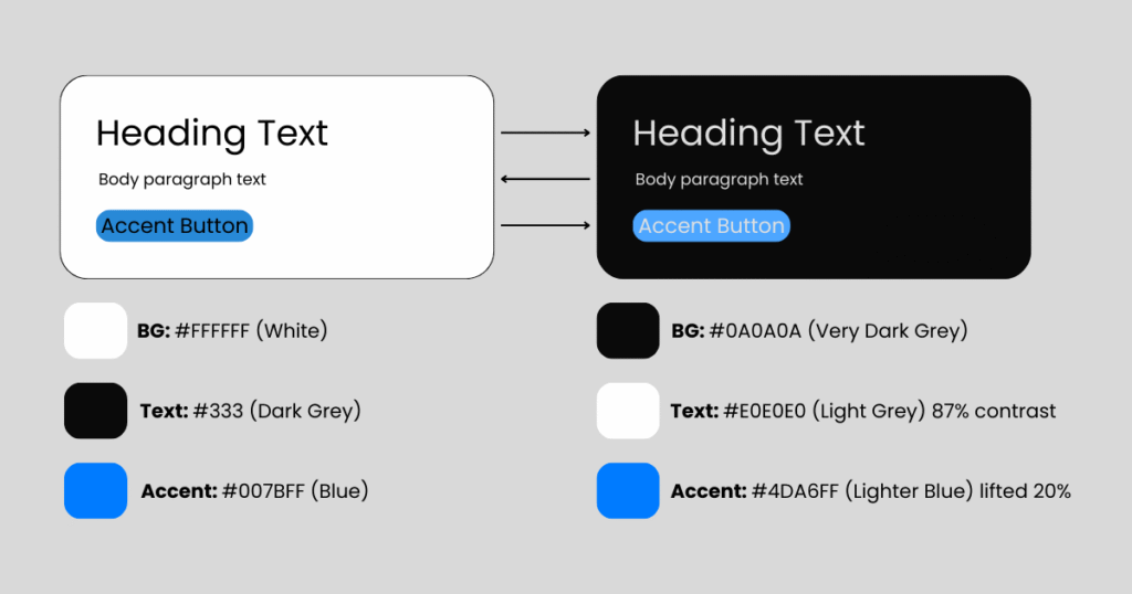
Dark mode flips light mode: backgrounds go 10-20% black (#121212), accents pop brighter. Philosophy: Maximize contrast without glare.
Fundamental Shift Diagram (text-based):
Rule one: Design light and dark simultaneously in Figma variables avoids afterthought ports.
Color Theory for Dark Mode Design Backgrounds
Dark BGs demand desaturated palettes. Vibrant light-mode blues (#007BFF) turn neon; mute to #5A9FFF.
- Backgrounds: Pure black (#000) crushes depth—use off-black (#121212) for “true dark.”
- Surfaces: Layered cards at 12% (#1E1E1E), 24% (#2D2D2D) for hierarchy.
- Accents: Boost luminance 15-25% (e.g., green #10B981 → #34D399).
- Borders: Subtle 4% gray (#333) over sharp whites.
Spotify masters this: Album art desaturates 20% in dark, preserving vibrancy without bleed.
Typography and Readability Rules
Light text on dark kills legibility if contrast dips below 7:1 (WCAG AAA).
- Font Weights: Bump body to 400-500; thin 300s vanish.
- Line Height: 1.6-1.8x (vs. 1.5x light) fights “rivers of white space.”
- Letter Spacing: +0.02em prevents tight clustering.
Pitfall Preview: 12px text at 4.5:1 contrast? Unreadable after 5 minutes.
Best Practices for Icons, Illustrations, and Assets in Dark Mode
Invert sparingly photos need selective masks.
- Icons: Stroke-based (SF Symbols) auto-adapt; filled ones lighten fills 30%.
- Illustrations: Recolor in dark palette; gradients from #1A1A2E to #16213E.
- Images: Darken 10-20% or add subtle vignettes.
Figma’s icon sets with color variables shine here export once, toggle everywhere.
Accessibility in Dark Mode Design
Dark mode amplifies issues: Low-vision users need Reduced Motion + high contrast modes.
- Contrast Minimums: Primary text 15:1 (e.g., #FFFFFF on #111).
- prefers-color-scheme: CSS media query for system respect.
- High Contrast Mode: Separate palette (e.g., #000 BG, #FFF text).
- Testing: macOS Dark Mode + Windows Night Light + iOS Smart Invert.
Apple’s Human Interface Guidelines mandate this ignore, fail audits.
Implementation Frameworks
CSS-First Approach (Tailwind/CSS Variables):
:root {
  --bg-primary: #fafafa;
  --bg-secondary: #f5f5f5;
  --text-primary: #111;
}

@media (prefers-color-scheme: dark) {
  :root {
    --bg-primary: #0a0a0a;
    --bg-secondary: #1a1a1a;
    --text-primary: #e0e0e0;
  }
}
Design Systems: ZeroHeight or Storybook for light/dark previews. React Native? NativeWind with useColorScheme().
Real-World B2C Dark Mode Design Examples
Instagram: Seamless Toggle Magic
Feed desaturates subtly; Stories glow with lifted emojis. DMs use #0F0F17 BG—zero glow, infinite scroll bliss. Result: 20% night-time session boost.
Notion (B2C Angle): Block Perfection
Database views layer surfaces elegantly (#2F2F2F cards on #0D1117). Toggle feels native, no relearn.
Fail: Early Discord
Overly bright accents caused “purple eye”—fixed with 18% desaturation.
Real-World B2B Dark Mode Design Examples
Slack: Enterprise Dark Mastery
Thread previews at 12% gray, reactions pop at 60% luminance. Integrations sidebar uses precise borders—pros praise zero fatigue during 8-hour shifts.
Figma: Canvas Dark Mode
Layers panel inverts cleanly; artboards get subtle glow (#202030). Collaborative editing shines—no glare in shared screens.
Salesforce Lightning: Segmented dark with accessibility sliders B2B admins customize contrast.
Actionable Dark Mode Design Best Practices Checklist
Below are the 10-Point Dark Mode Audit (15 mins):
- Palette Check: 4-6 surface tones? Accents lifted 20%?
- Contrast Scan: WAVE tool—all 7:1+?
- Toggle Test: System-level switch seamless?
- Image Audit: No crushed blacks or blown highlights?
- Typography: Line height 1.7x? Weights bumped?
- Icons: Stroke-only or variable fills?
- Motion: Reduced in dark (prefers-reduced-motion)?
- Battery Test: Android Dark Mode drain < light?
- User Test: 5 users eye strain after 10 mins?
- A/B Live: Track engagement delta.
Pro Tip: Save as Figma component set reuse across projects.
Dark mode isn’t about black backgrounds; it’s about controlled light in a dark world – Sarah Doody, UX strategist.
Common Dark Mode Design Pitfalls and Myths
- Myth 1: Invert All Colors
Results in sickly greens/blues. Fix: Recolor manually. - Pitfall 2: Pure Black Backgrounds
OLED crush kills depth—use #121212 minimum. - Myth 3: Users Don’t Notice
They do 82% enable it; poor impl = silent churn. - Pitfall 4: Forgetting High Contrast
Windows forced dark? Your app breaks. - Myth 5: One-Time Effort
Seasonal tweaks (Halloween oranges) keep it fresh.
Performance and Battery Impact
Dark mode saves 30-47% battery on OLED (Google Pixel tests). But heavy glows (white cards) negate it.
Optimize:
- Compress dark assets 15% less (already dim).
- Lazy-load unchanged light images.
- CSS containment for repaint savings.
Future Trends in Dark Mode
2026+ predictions:
- Adaptive Dark: ML adjusts based on ambient light (iPhone True Tone evolution).
- Color-Aware Dark: Preserves brand hues via perceptual uniforms (OKLCH).
- AR/VR Dark: Spatial UIs dim for eye health.
- Personalized Palettes: User-set luminance (e.g., Notion’s upcoming experiment).
Glassmorphism layers will blend light/dark fluidly.
Trend Flow:
text
2026: System Toggle → 2027: AI Ambient → 2030: Neural Eye-Tracking Essential Takeaways from Dark Mode Design Best Practices
- Design Dual from Day One: Variables beat retrofits.
- Contrast is King: 15:1 primary text, always.
- Layer Smartly: 4-6 surface elevations.
- Test Ruthlessly: Battery, eyes, accessibility.
- B2C Engagement, B2B Endurance: Tailor per audience.
- Evolve with Tech: Ambient + personalization next.
Test Your Dark Mode Design Today
Pull your latest prototype run the 10-point checklist. Which pitfall hit hardest? Share screenshots in comments or tag me for a quick review. Teams I consult cut redesign costs 40% by auditing early. Prototype a toggle this sprint; measure the lift. Your users’ eyes await.
Conclusion
As 2026 approaches, Dark Mode Design Best Practices have become essential rather than optional. User expectations have evolved today’s users demand clarity, accessibility, and visual balance across devices and lighting conditions. A simple color inversion is no longer sufficient. The most effective teams design light and dark modes simultaneously, ensuring consistency, performance, and readability from the very beginning.
When implemented correctly, dark mode supports longer usage sessions, delivers better accessibility outcomes, and strengthens overall product perception. It is no longer a cosmetic choice, but a clear indicator of how seriously a product prioritizes user comfort and usability.
Latest Blog Highlights: https://embarkingonvoyage.com/corporate/how-to-choose-the-right-co-creation-product-development-partner/